Hey everyone... In this post, I wanted to share a short adventure with one of my daily design challenges where I had to design a simple button in Figma. And thus begins the real fun, as sometimes the simplest things are the hardest of all.

The Challenge
It started with me being given a wireframe (the above sample image) of the exercise was simple, the above image is the wireframe, to design a basic button in figma sounds easy, right? A button may seem to be an insignificant item, but in the grand scheme of experience it is actually one of those things that either make or break a user’s experience. One thing I knew when I designed one was that it needed to be done right.

Getting Started
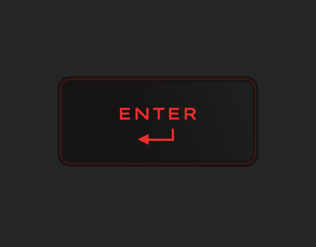
Before I started designing, I paused to look at my laptop’s "Enter" key. It feels so satisfying to press that key and I tried my best recreating the feeling in my button. Which is why I took this snap of it to refer back to later.
I opened up Figma, ready to dive in. The wireframe was simple as a rectangle. But the challenge was to bring that to life, to turn a basic shape into something that people would want to click.
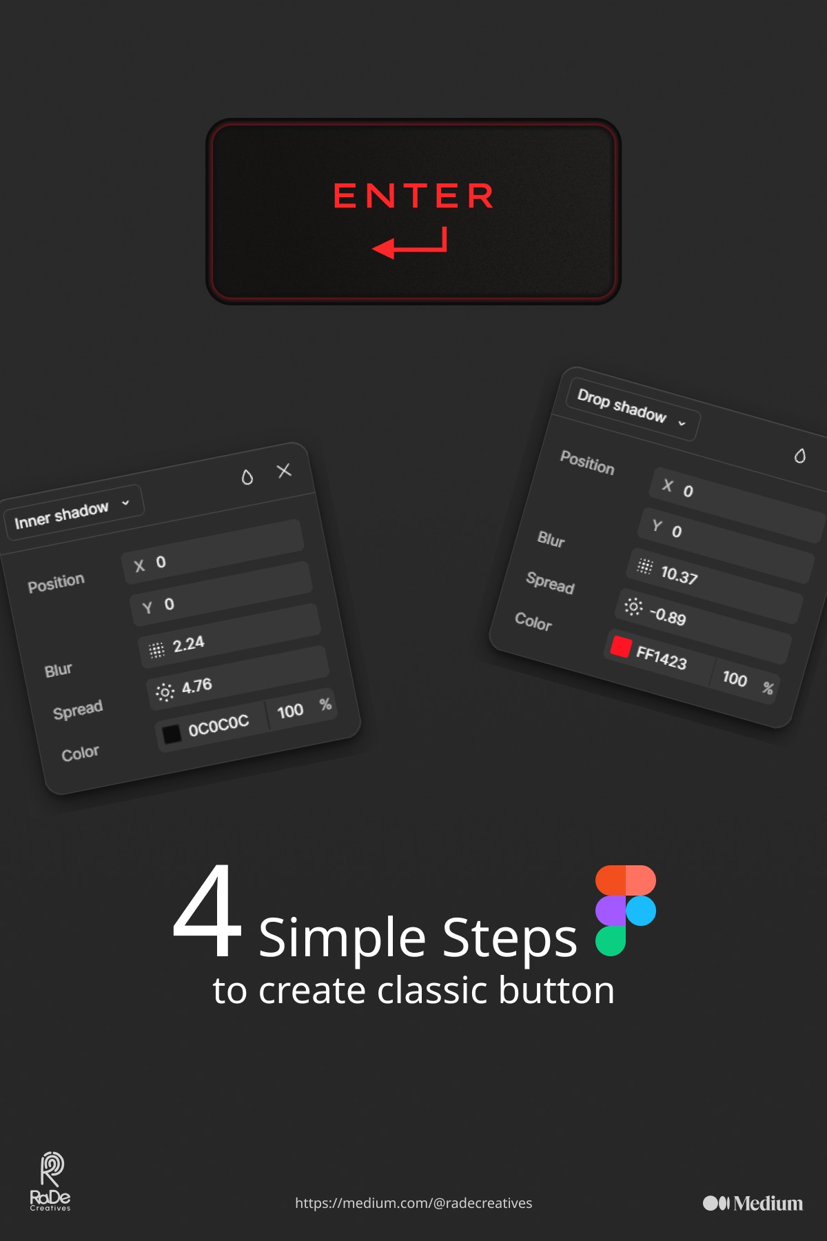
Their given frame size is 1600 X 1200. First, I thought about the basics: the size, shape, and color. I have created the frame and fill with #2A2A2A black and added a noise texture for depth.
Used this plugin: https://www.figma.com/community/plugin/1138854718618193875 for noise and texture.

Play with this plugin for sometimes and I make the background layout for that button.

I chose to go with a rounded rectangle because honestly so many sharp edges are just too much sometimes. Rounded corners provide a more inviting and softer touch. The color code of #141414 was used for the fill.

Adding the Details
Once the shape and color were locked in, it was time to add the details. I added a subtle inner shadow to give the button some depth.

Then Create another rounded rectangle and filled with linear gradient, and some noise texture with the help of the above mentioned plugin.

For that exact enter button from the reference I took, gave some inner shadow of dark color and drop shadow with red color.

Next, the text was simple “Enter” in a bold, easy-to-read font. Added an icon using iconify plugin : https://www.figma.com/community/plugin/735098390272716381
Finally!!!

Wrapping Up
So there you have it a classic button, from wireframe (sample image) to the perfect shaped classic "Enter" button, made in Figma. Now arguably, this sounds like a small hurdle they usually are but these minute evocations hone our brains, pulse the point that every aspect in a design is critical and ensures that we don’t overlook the minor stuff.
Had so much fun doing this daily design challenge and look forward to sharing more these with you 🙂
I hope this was a fun little trip with me to those who are designers like me or curious about how the process goes.
So there, I leave you, design often and make more! 🚀